Style Guide
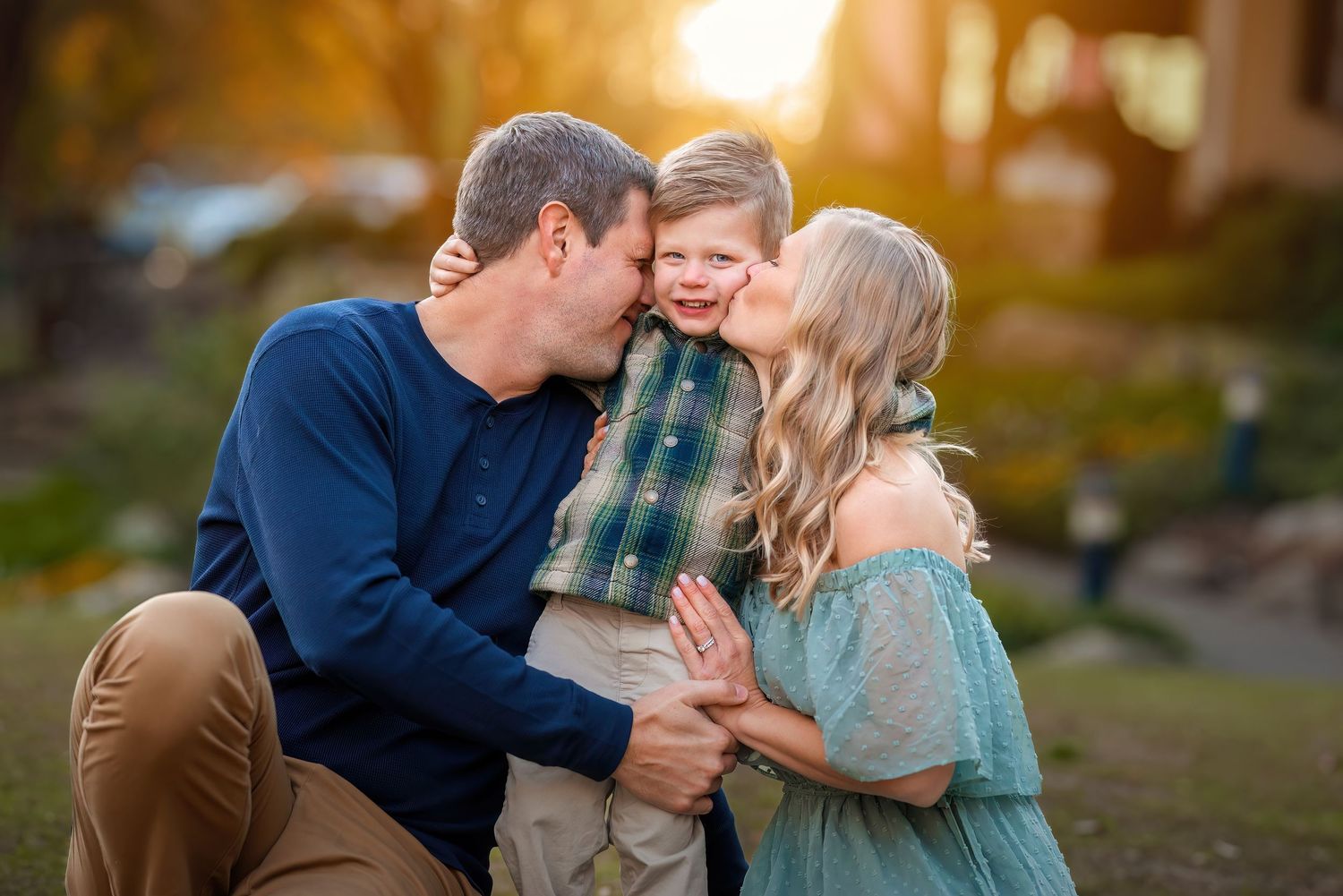
One of the key ingredients to stunning photos is your outfit choice. It's one of the most common questions I get: “What should we wear?” Your clothing can truly elevate your images, helping them look timeless, cohesive, and uniquely you.
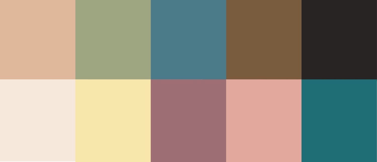
If you're looking for guidance or a little inspiration, here are some of my go-to styling tips, favorite color palettes, and things to keep in mind when planning your outfits.
What to Avoid:
- Bold, heavy patterns like polka dots, chevron, or thick stripes
- Clothing with characters or cartoon prints
- Visible logos (Nike, Adidas, etc.)
- Hoodies and casual graphic t-shirts
- Neon or overly bright colors
- Matching everyone in the exact same color
- Baseball caps or ball caps
What to Look For:
- Solid, neutral, darker toned vivid colors, or earthy tones that photograph beautifully
- Subtle patterns (a little plaid, floral, or texture can work well in moderation- beware of pattern layering and having too much though)
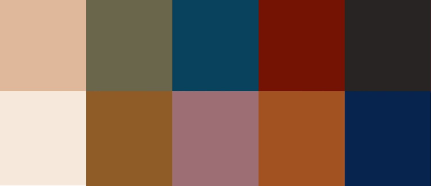
- Choose 2–3 complementary colors from a palette to create a cohesive look across the group
- Accessories like jewelry, hats, scarves, and layers (cardigans, jackets) can add depth and visual interest
- The goal is to coordinate without being too “matchy.” When everyone feels comfortable and confident in what they're wearing, it truly shows in the photos.
Fall/Winter Color Palettes
Spring/Summer Color Palettes